Redefining Listee's Digital Experience

DESIGN SYSTEMS · UI DESIGN


Overview

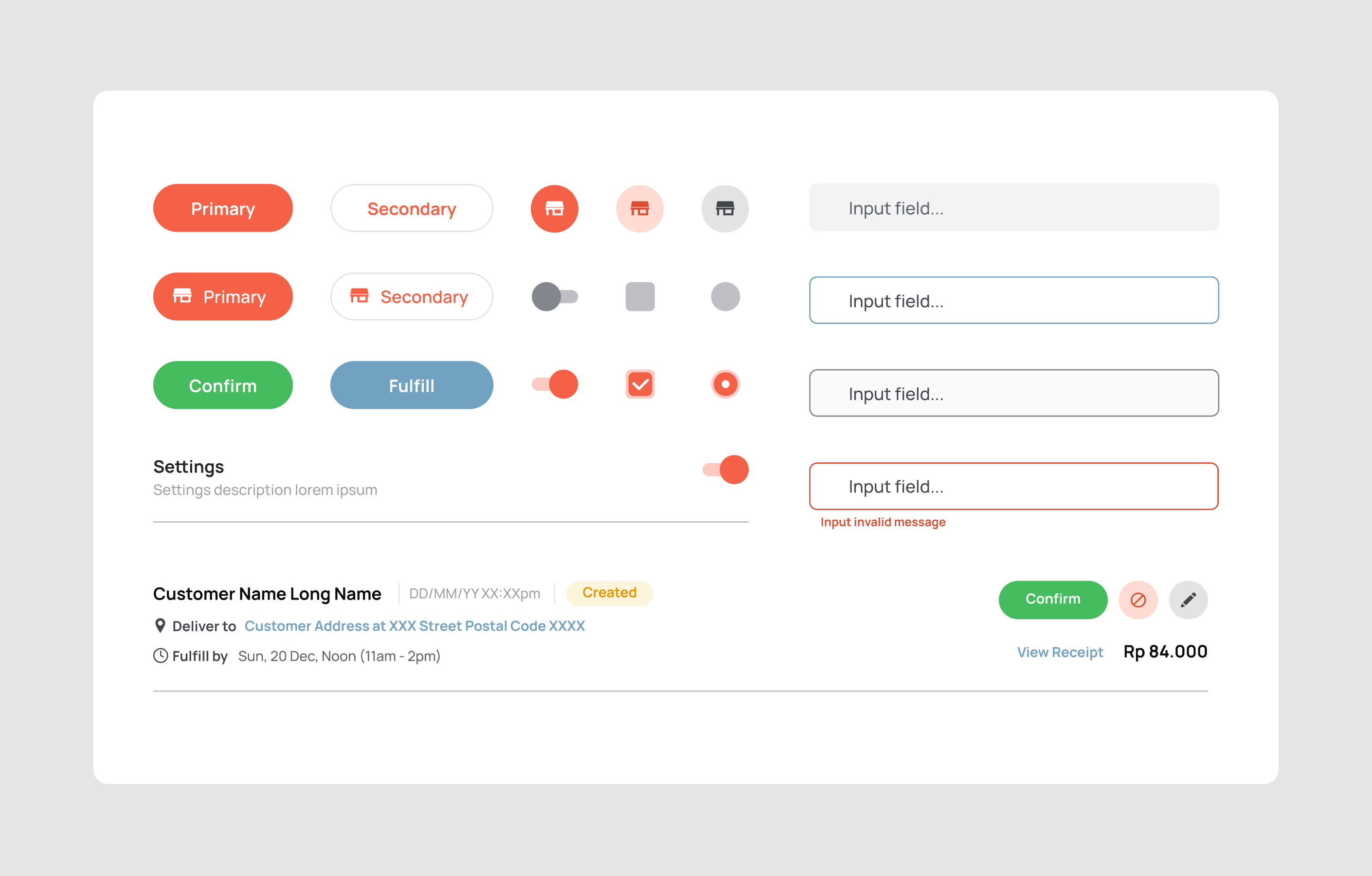
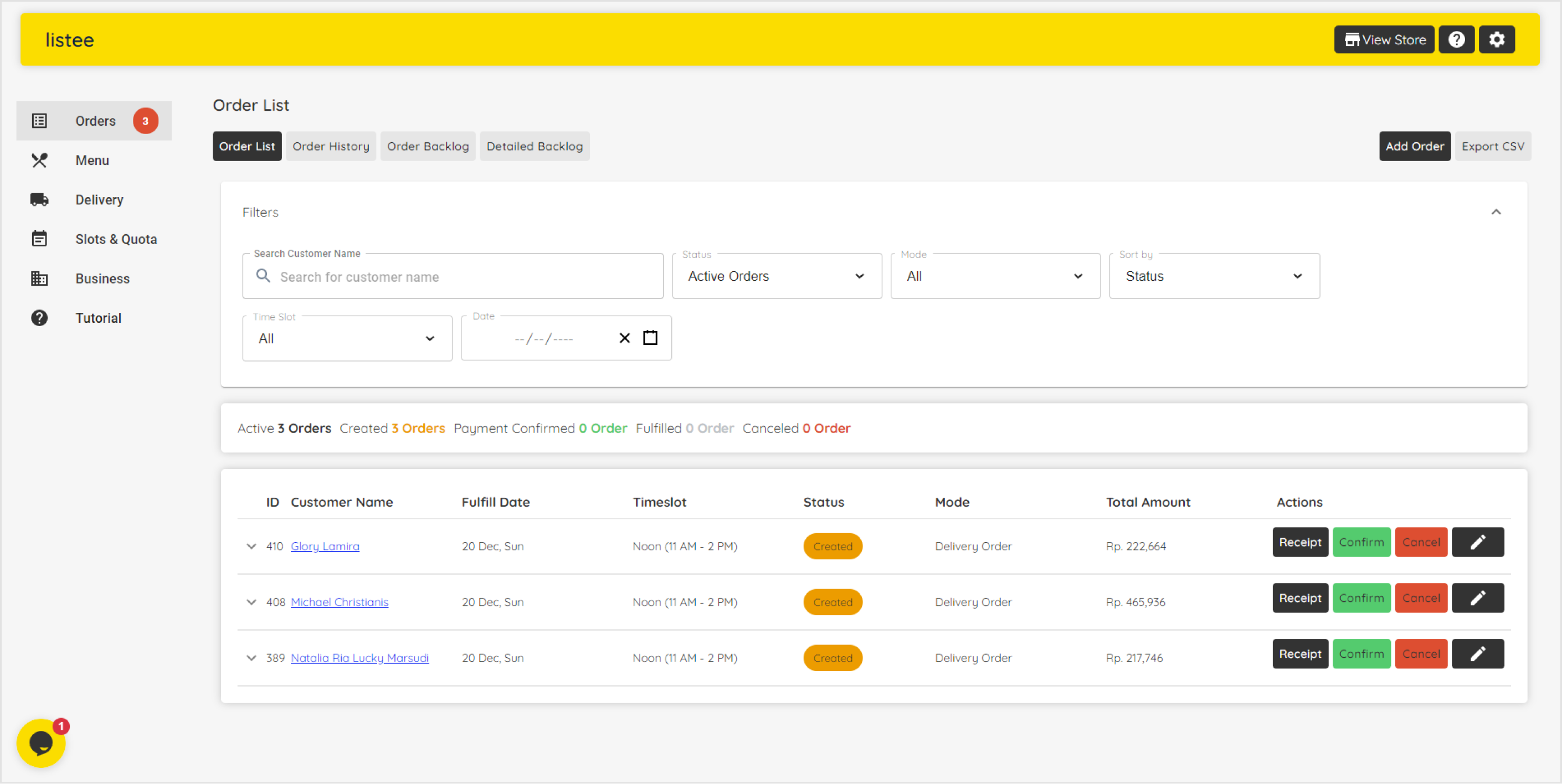
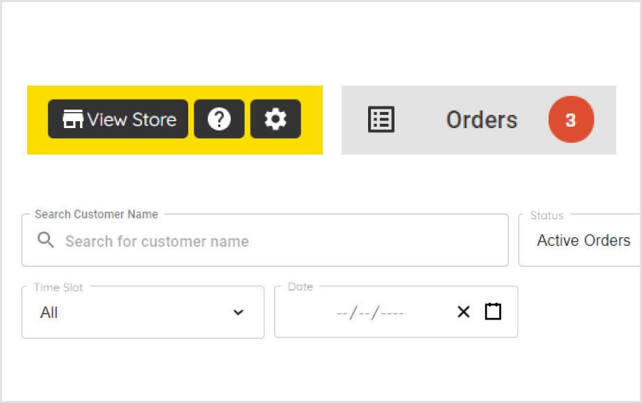
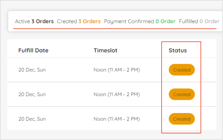
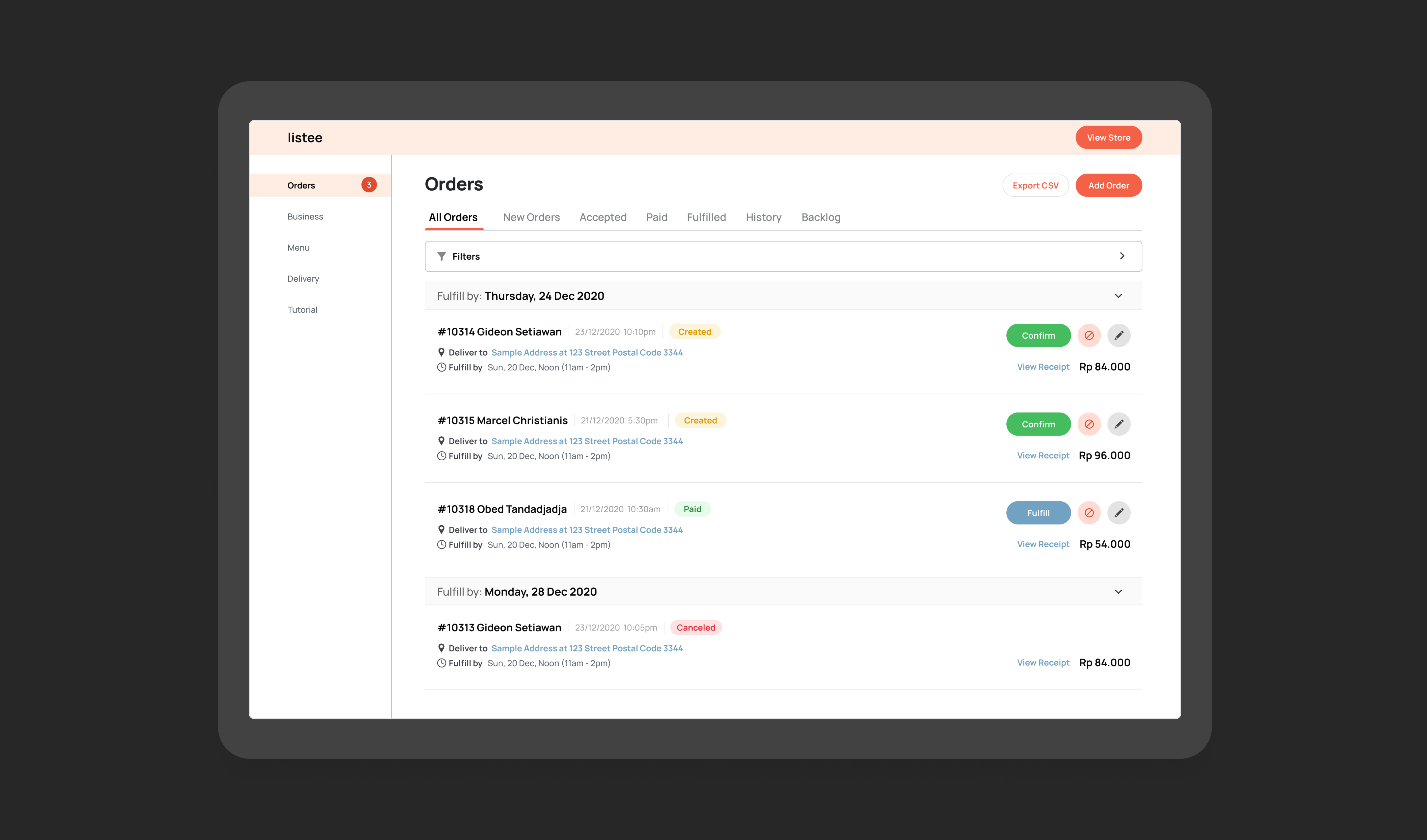
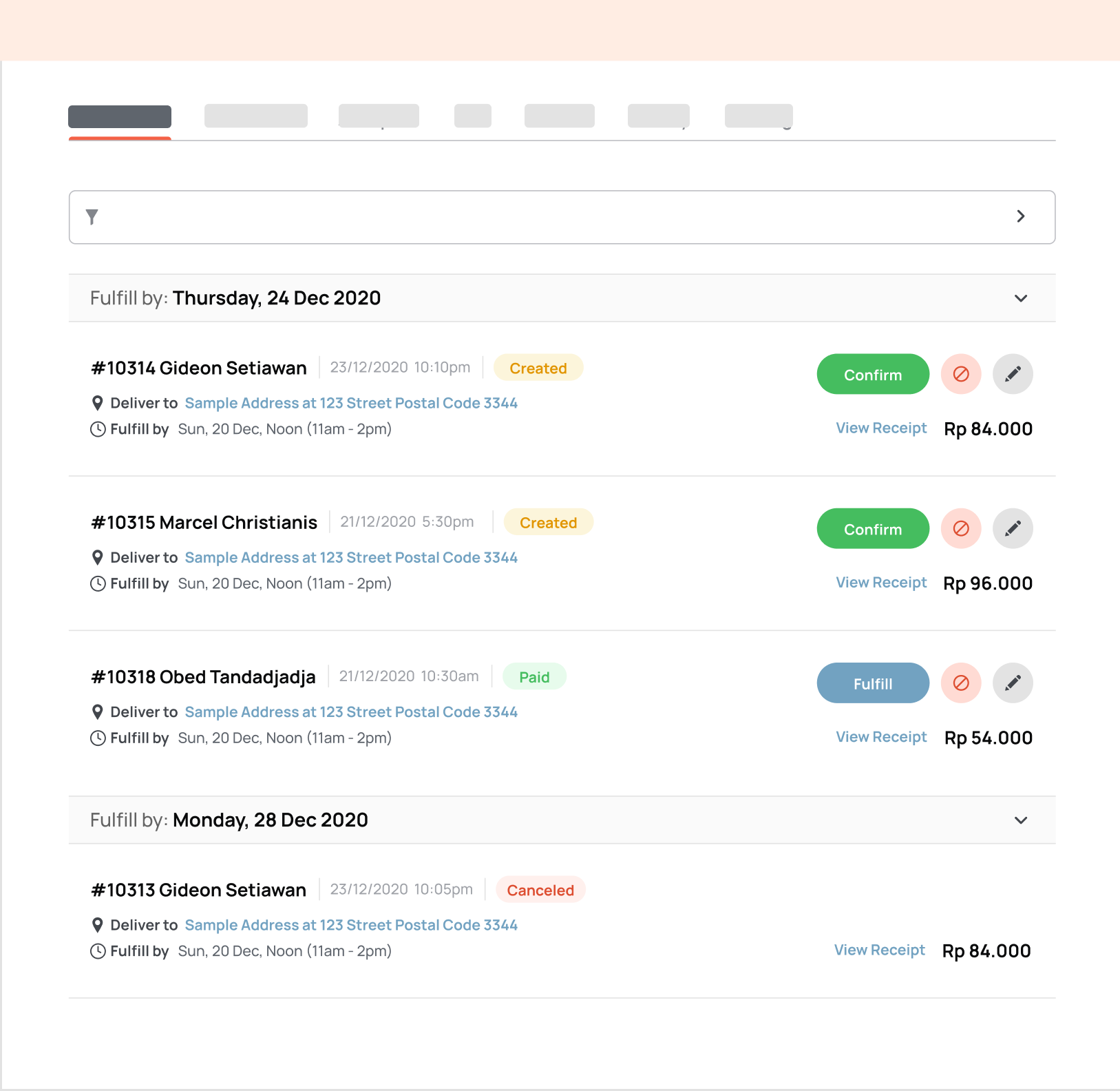
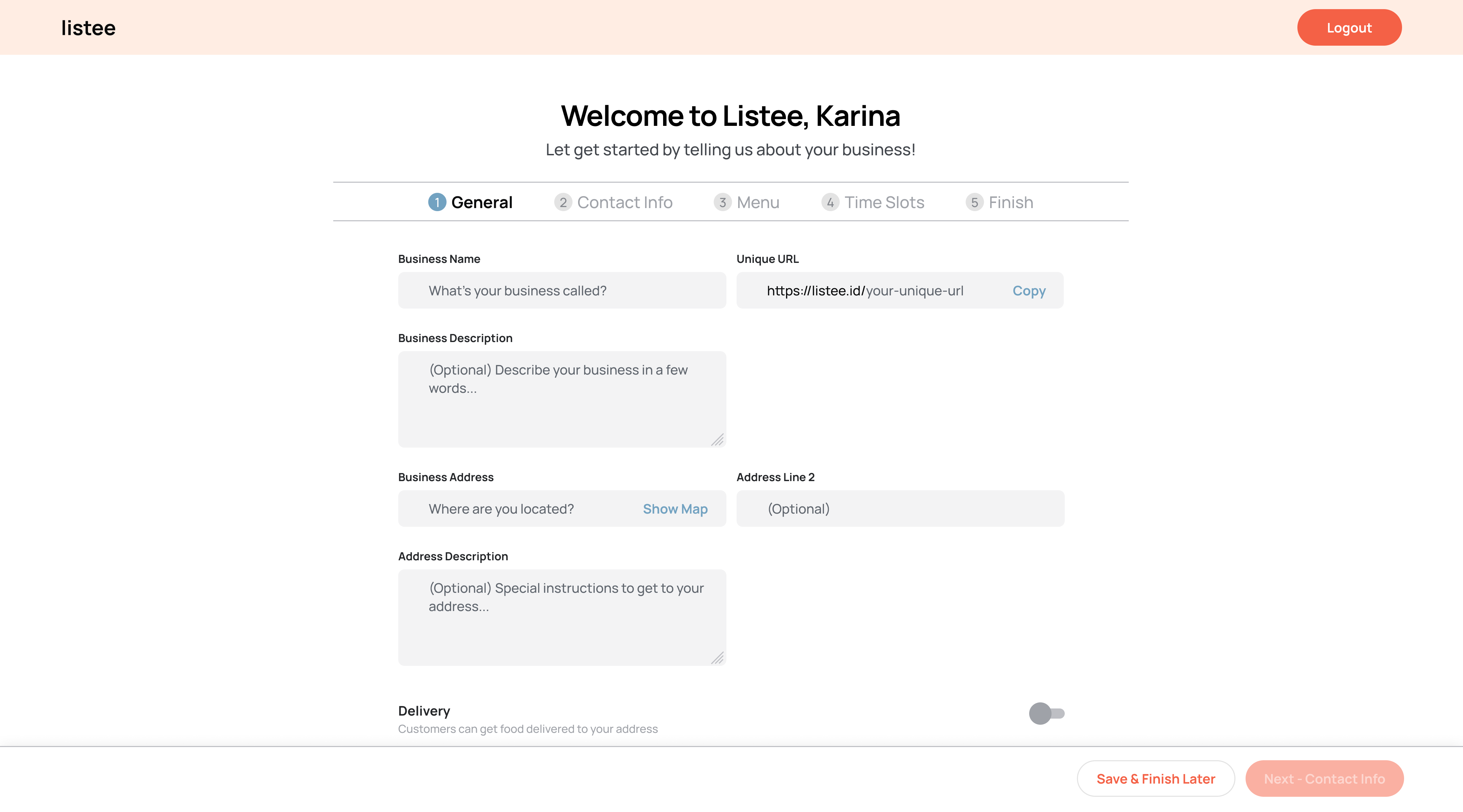
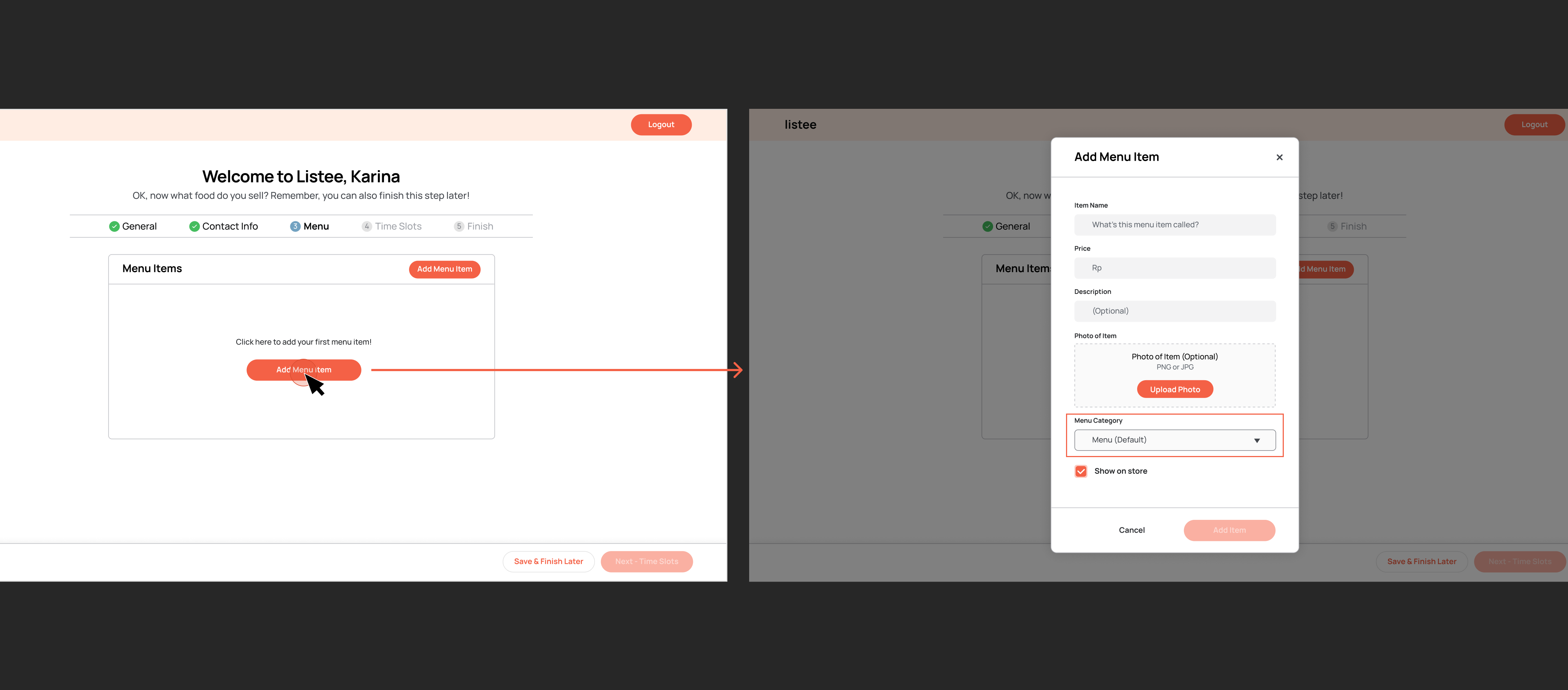
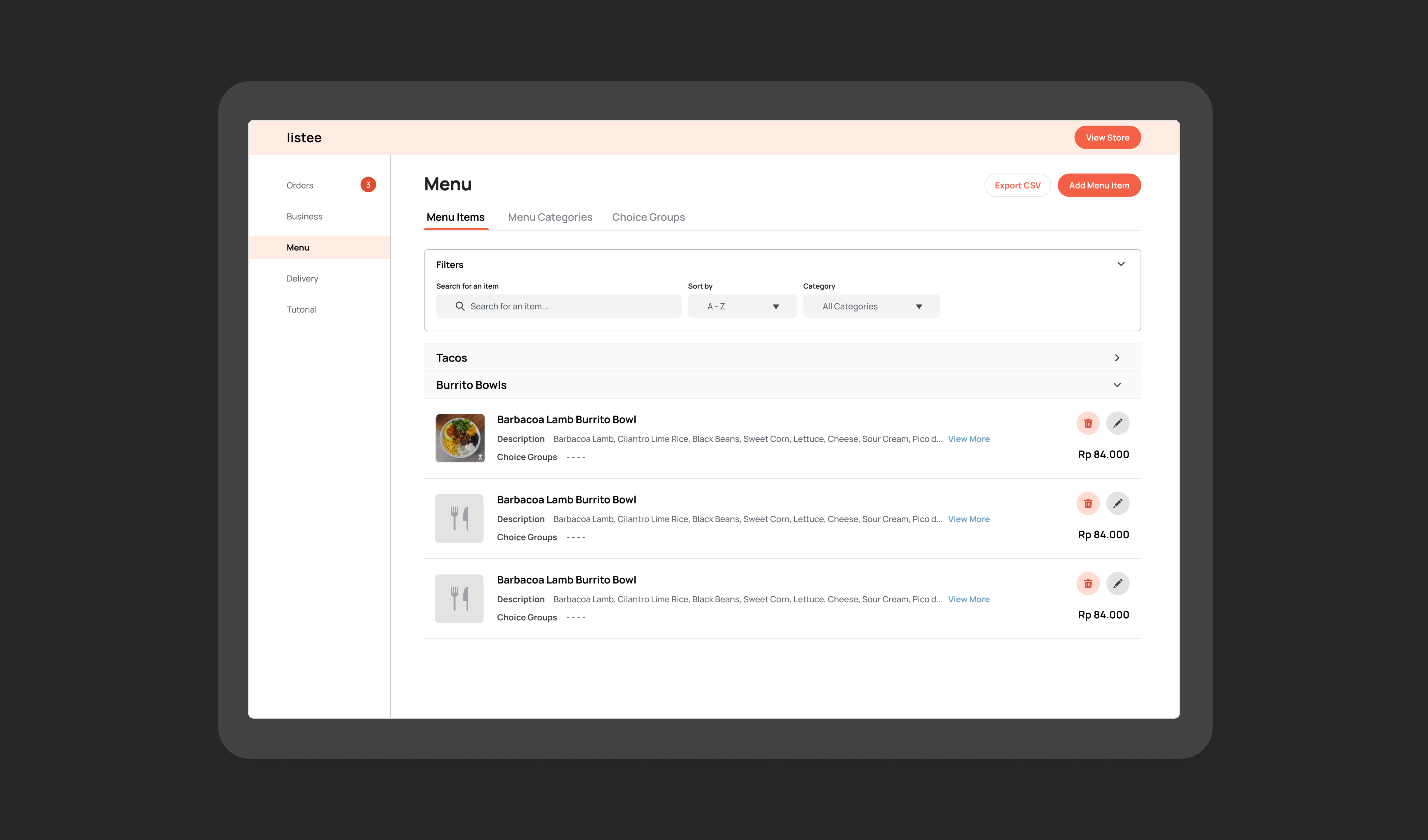
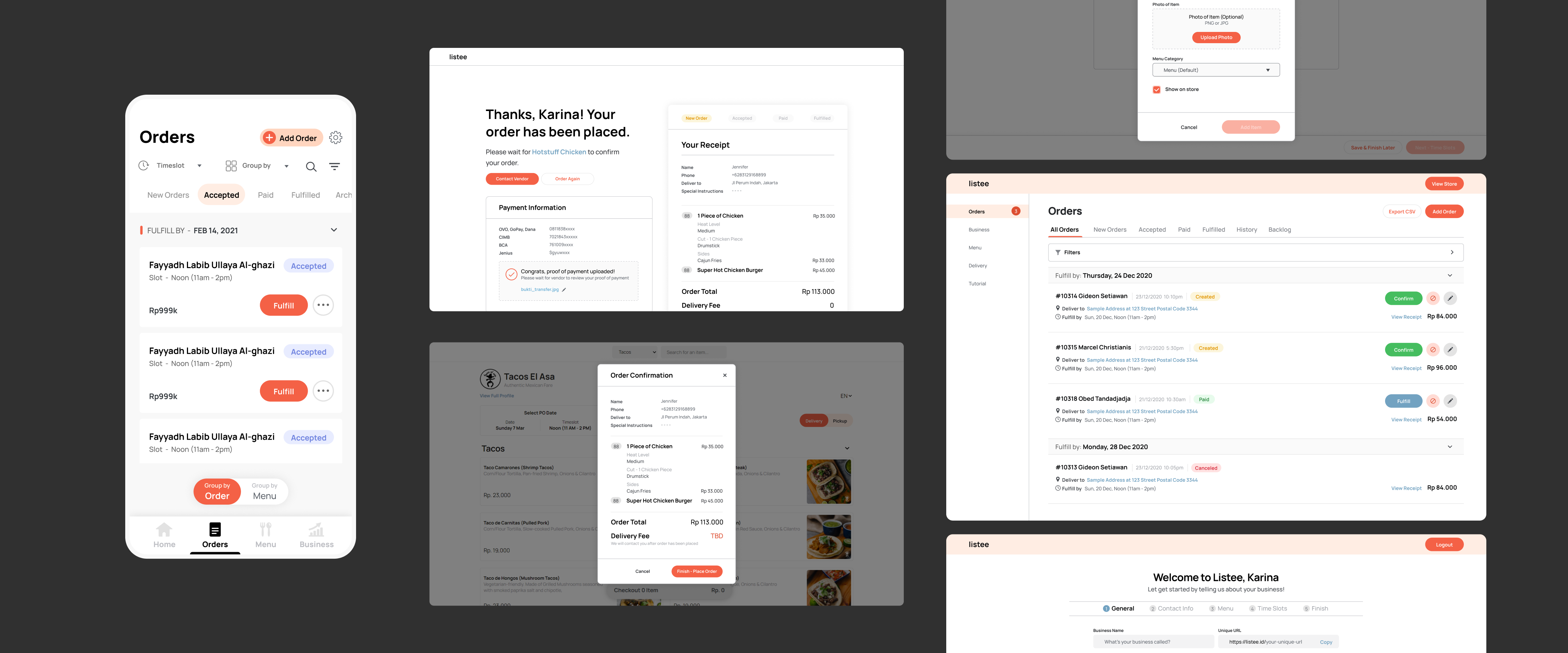
As Listee's first UX designer, I was blessed with the opportunity to do an overhaul of Listee's entire design experience. I mostly focused on the merchant dashboard experience but I also contributed to the landing page and virtual store design. It was definitely a huge undertaking and I wouldn't have been able to accomplish this without my wonderful teammates and the positive environment at Listee.

Employment Timeline
Nov '20 - Present

Company
Listee

Role
UX Designer

Special Thanks to
Teammates - Gideon Setiawan, Marcel Christian, Obed Tandadjaja, Melvin Yuwono

WHAT IS LISTEE?

Listee provides services for online pre-order food businesses, such as a virtual store setup, order management, and customizable e-receipts.

Listee was acquired by Yummy Corp in February 2022.
WHAT DID I DO?

I worked with a small team of developers to create a fluid digital experience for merchants who manage their online restaurant businesses using Listee.

I began with an interface audit and uncovered a myriad of design issues. The new experience was later handed off in a library of reusable UI components which significantly sped up build times and served as building blocks for new features.

Problem Areas

Pre-redesign, Listee's app interface worked but had a combination of many minor issues ranging from visual design, user experience and even wording.

Visual Design

Inconsistent Visual Style
The UI elements were a mix of Listee's own branding and default material UI components.

Dense Data Tables
Data tables are overloaded with information and none of the data fields really stand out.

No Distinction Between UI Bits
There is little to no distinction bewteen buttons, tabs, etc., plus lack of color contrast doesn't help.

User Experience

Problematic Double-Click Pattern
When users click some action buttons, such as "confirm order" and "cancel order", the button will change into a checkmark that they will have to click again to confirm that that's the button they want to click.

This flow is problematic because, besides the fact that it's not a common UX pattern, users need to click the area outside the button to return it to the original, non-checkmark state which is really not intuitive.

Tedious Initial Setup Process
Initial setup process consists of very long forms where users can't skip and finish later. Main action buttons are also buried in the very bottom of those forms.

Unfriendly Error-Handling Mechanism
Users are required to create menu categories first before menu items. Otherwise, they will get glaring red error banners. Little warning notes are also spread in many places which leaves behind a bad taste.

Tone & Wording

For our target users who are more familiar with conducting business using manual processes or via Instagram and Whatsapp, technical lingo like "backlog" are not ideal.

Long button names and the various errors that aren't always clear how to fix only contributes to the unfriendly tone.

USER FLOWS

Setting Up the Virtual Store

USER FLOWS

Orders Page

Key Takeaways

Receiving Orders
Merchants see the customer name / order ID as the main identifier of the order without having to see the detailed receipt.

Order Price
Next, merchants will see the total price of the order which gives them a rough idea of how big the order is.

Payments
Payment can happen at any point between order received and fulfilled. Some merchants are more relaxed and would customers pay later, whereas some would refuse to make the order until payment is received.

Order Status
Throughout the ordering process, there is a total of 5 order statuses before the order moves to the delivery phase - order created, accepted, canceled, fulfilled, and paid, which can overlap.

Pseudo-onboarding
There was no real "onboarding" flow in the old experience. Users were prompted to create an account via the landing page, then they have to navigate between different tabs to set up their virtual store.

Error Handling
Features are inaccessible until users finish putting in all the information. So, every time users try to access those features without completing all the forms, an error will be thrown at them.

Design Goals

Friendly
Instead of throwing errors, Listee needs to guide the users through the right steps with a less technical tone.

Methodical
Listee's app flow should mirror the users' workflow when they're receiving orders in real life.

Flexible
The app interface needs to be scalable, adaptable to different kinds of orders and screen sizes.

Final Outcome

Orders Page

Tabs as Order "Statuses" / "Stages"
Tabs reflect a general flow of an order

Fulfill Date as a Timeline
The orders page serves as a timeline to help merchants plan out which orders to get done first.

Replaced Data Tables for Orders
We make some parts stand out more, such as customer name and order price in a big, bold font and links in a different color.

Main action buttons that customers use to move an order from one stage to another are more prominent than functions like "edit order" or "cancel order" that aren't used as often.

Onboarding

Step-by-Step Onboarding
This was our way of showing users how much they have left to go and grouping input fields that are related to each other.

Accessible Action Buttons
"Next" is disabled until users fill required information. There's an option to finish later, and buttons are stuck to the footer.

Default Menu Category
When users are first in the app, a default menu category is automatically created so users won't encounter errors.

Language & Tone
We welcome the users into the app with friendly language which also acts as a guide to go through onboarding.


Reusable UI Components

According to the developers I worked with, this wasn't just a better design but also one that was easier to implement. It was easier to format than data tables and easier to adapt to different screen sizes.

Besides streamlining the experience for the end user, standardizing input labels actually cut map load API call by 75% despite other API calls increasing.