
Listee
6 months
UX Designer
1 PM, 2 developers, 1 designer
→
The number of active users rapidly increasing
→
Significantly sped up build times
→
Some API calls reduced despite overall usage increasing
→
Users voluntarily sharing the new experience on their social media
Thanks to teammates - Gideon Setiawan, Marcel Christian, Obed Tandadjaja, Melvin Yuwono

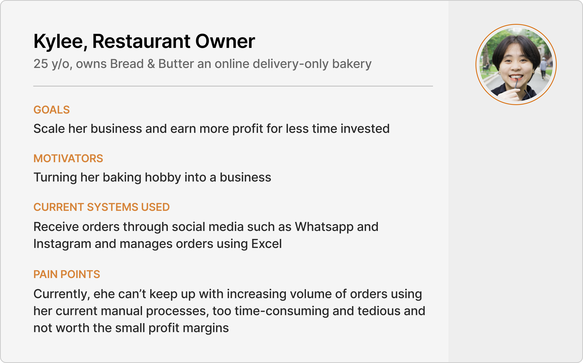
It was most evident when talking with restaurant owners who were interested in using Listee, as they needed the Listee team to walk them through every single step. Even after, they still reached out a lot to ask how to perform actions within the app that were supposed to be key workflows. To methodically address all problem areas, we kicked off the design process with an interface audit of the product with the internal team.

Old merchant dashboard main page

It takes a lot of effort to scan each field to find information, as no piece of information really stands out.
For some action buttons, users need to click twice to confirm the action. Although this saves time, this is prone to cause user errors.

3-4 CTA buttons in each field can be too much for users who are deciding what to do next once they see the order come in.
Users can expand the table rows to show more info or view the detailed receipt. But, the only real difference the expanded table showed was the ability to send the receipt.
Technical lingo like “backlog” created an unnecessary learning curve and long button names strained the users.

Listee’s UI was a mixture of their own custom components and material UI components, with little to no distinction between UI elements such as buttons, tabs, etc.
I compiled all our observations into a user journey map which showed in detail how Listee would fit in our users' (merchants) routine starting from receiving orders up to fulfillment. From here, we were able to clearly see user pain points and design opportunities at each stage.

→
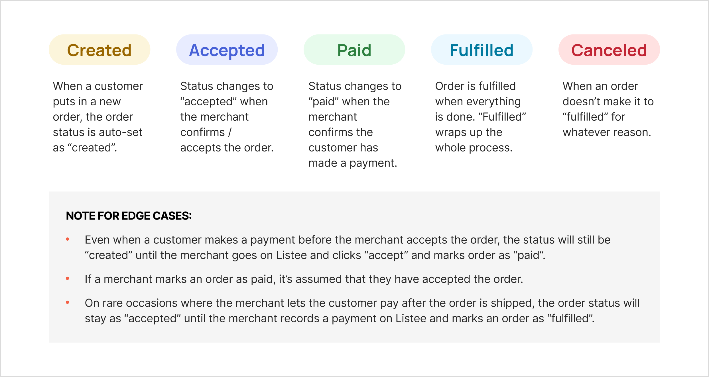
Payment happens outside of Listee, and can happen right after customer orders or after merchant confirms order
→
Having to scroll down the whole list of orders and use filters to search new orders is a major time-sink
→
Order status is a key driver that determines the merchant's next step
The current order status / categorization was confusing as there was a status that reflected a progression from "created" to "fulfilled" and an umbrella active and inactive categorization. Together with the product manager, we made revisions that focused more into the linear flow of order stages which fit better with the users' workflow.
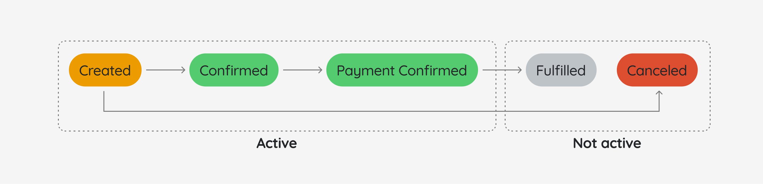
"Created", "confirmed" and "payment confirmed" are all categorized as "active" orders.
Order moves in a linear flow from “created” to “fulfilled” unless canceled, which aligns more closely with the merchant’s workflow for fulfilling an order in real life.
The merchant basically lives under the "order list" tab and only opens "order history" when they need to cross-check something. Additionally, backlog and detailed backlog both show an aggregated view of all orders but both are really similar to each other (this eventually became another project to revise the "backlog" feature).

Since all active orders are dumped in the "order list" tab, merchants have to scroll too much to correctly see new orders.
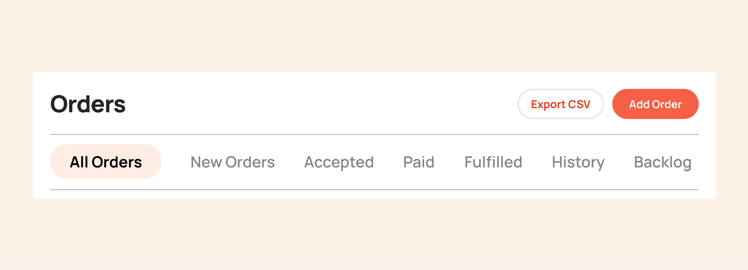
We made order statuses into tabs which gives merchants more ease of access to each order. They are able to intuitively move from left to right, following the order through each stage. Additionally, this design clears up more space visually.
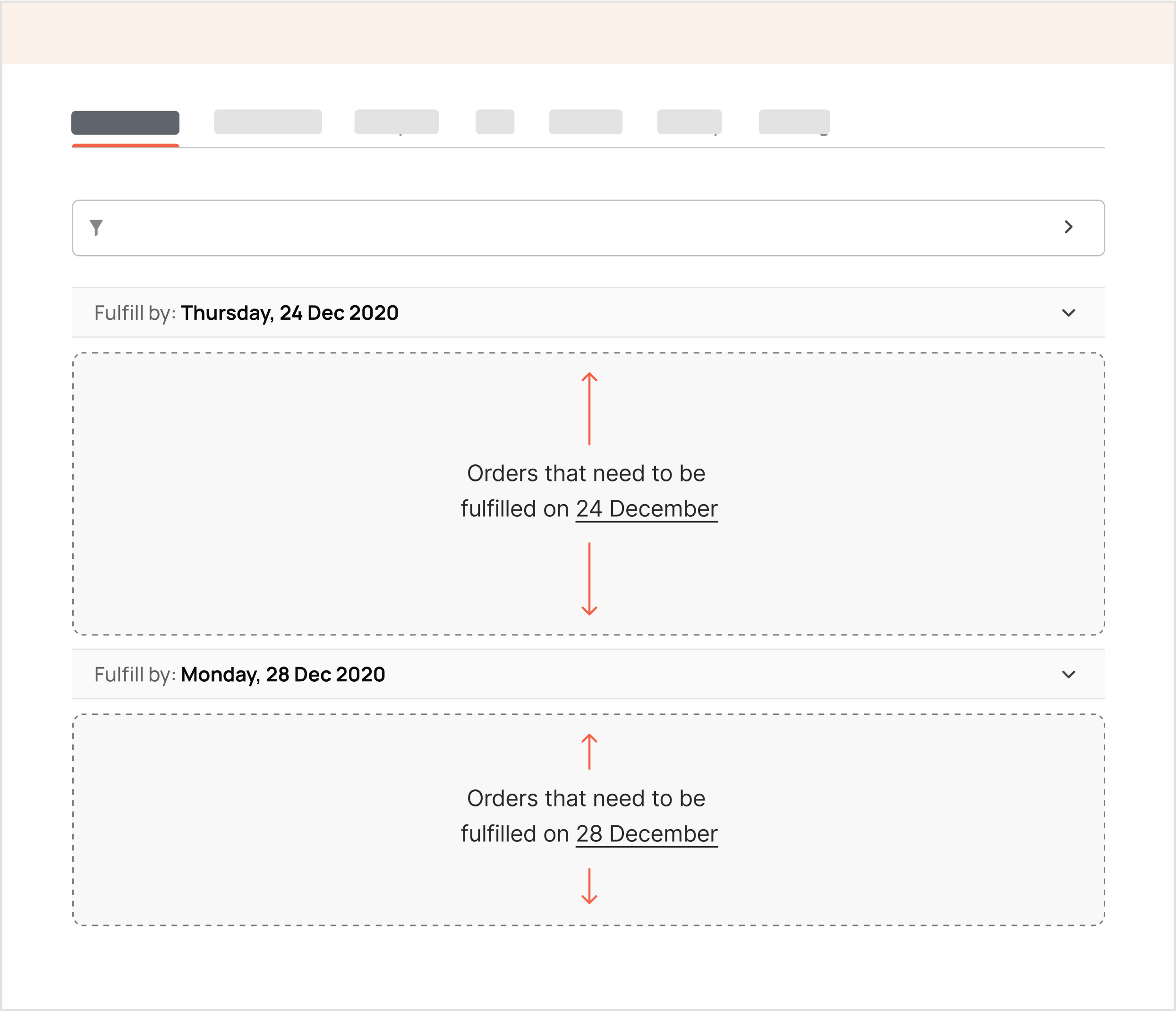
Since merchants like to plan and prepare their orders by batches, it made sense to give separation within the orders by fulfill date. This gets rid of the extra hurdle of looking through each order just to find the fulfill date.
We explored a few concepts on how to improve the data tables that made up all the orders since this was probably the most important part.
We explored a visually improved data table where rarely used buttons would only show while hovering on the table row.
This idea was scrapped because it’s still cumbersome to look for information by scanning each data point from left to right plus it was also more time-consuming to implement tables.

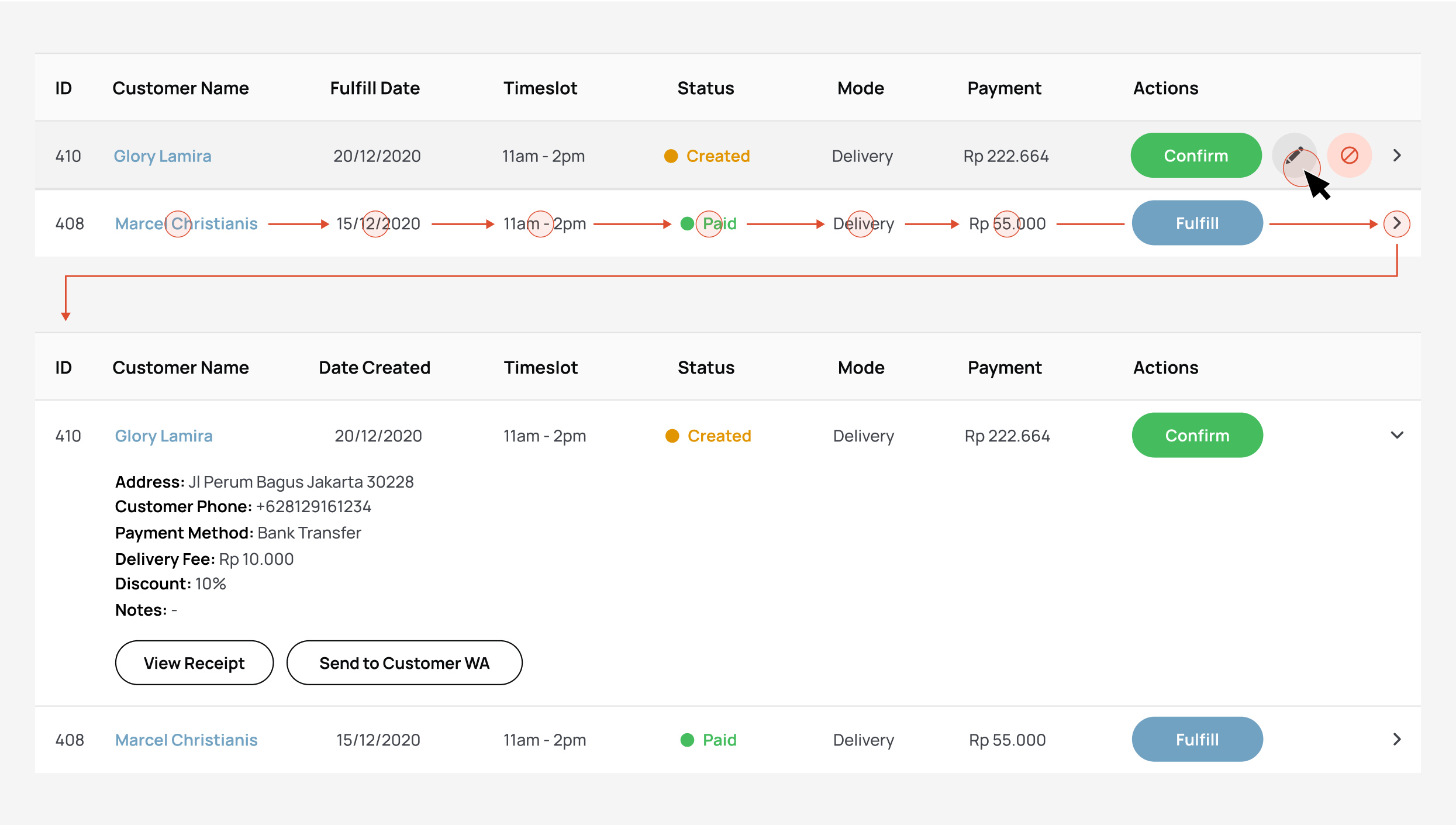
This order cards concept got more positive feedback overall, since it showed more hierarchy.
However, after testing internally, we found that the eyes still need to dart back and forth too much. Having the items on there also didn’t give as much value as we thought it would’ve since merchants would need to view and send the receipt to the customer anyways.
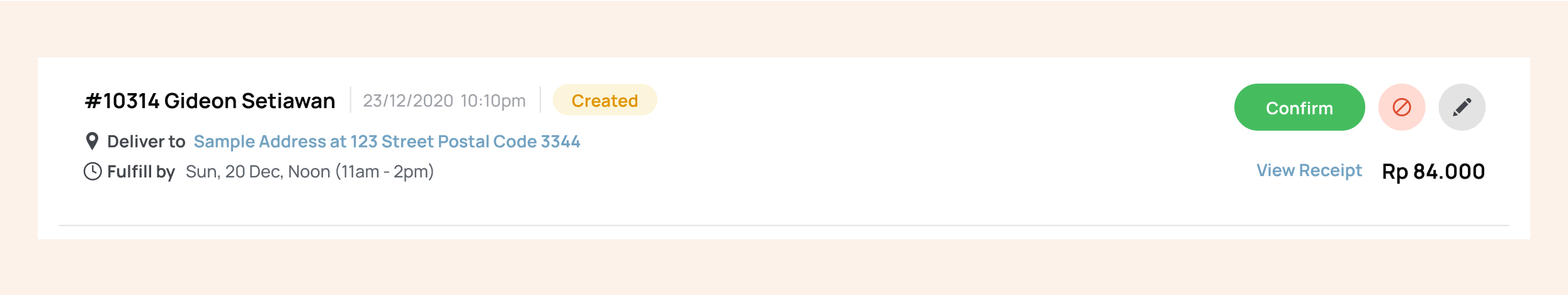
This revised order card is more concise and nicely grouped with all basic info on the left and all action buttons and total price on the right.
After this major update on the dashboard, we received overwhelmingly positive responses from merchants and saw the number of active users rapidly increasing.

The overhaul of this order management dashboard became the base for a design system creation, so Listee no longer needs to import material UI components into the mix. The new colors were decided on after a survey to determine colors that are deemed to be visually more appetizing and fitting for an F&B software company.

If I were to revisit this project again, I would have explored designing around screen responsiveness and breakpoints a lot more. In this particular project, I only found out that my card design can be made responsive after meeting with developers, it wasn’t an aspect that I took into consideration early on from the ideation phase.
Looking back at the way I approached this project, the components I redesigned such as the tabs and order cards made some of the functionality in the dashboard redundant. For example, the tabs that already categorize orders by status would mean “filter by status” is redundant. If I had more time or the chance to revisit this project, I would have put more consideration into how the components I redesigned affected the other components on the page.
After some time after this project has passed, I went to a workshop where I learned about accessibility. Although the color system I created got positive response for being able to differentiate the statuses well and fitting the brand image, almost all the color combinations failed the WCAG tests. Most of the buttons had around a 2.5 : 1 contrast ratio when I needed at least 4.5 : 1 for normal text.